Solution
TACKLE HUNGER WEBSITE REDESIGN AND MIGRATION

TIMELINE
May - July 2025
ROLE
PLATFORM
SECTOR
Non Profit, Social Good, Food Insecurity
UX Designer, Web Content Strategist and Developer
Squarespace ( Migration from Sanity)


Problem
Tackle Hunger is a nonprofit focused on combating food insecurity through national campaigns like the Souper Bowl of Caring. Despite having a strong mission, their website lacked clarity, especially during campaign seasons when users needed fast access to resources, donation pages, and event reporting tools.
As the lead UX designer, I noticed key usability issues:
Poor Information Architecture – Content was scattered and lacked a clear hierarchy, making it difficult for users to find what they needed.
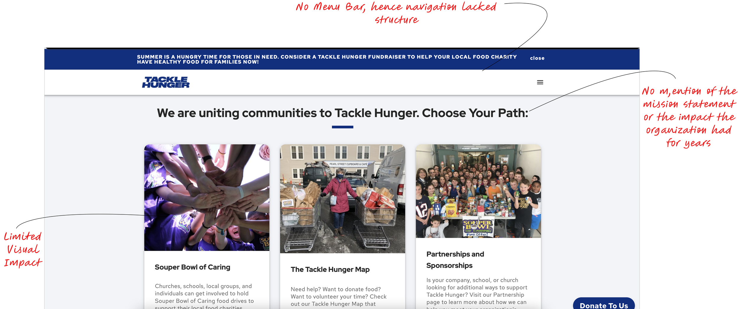
Missing Menu Bar – The navigation lacked structure, with key links buried or inconsistent across pages, leading to user frustration.
Disorganized Resources Section – Important materials for events and campaigns were grouped inconsistently, making it hard for users to locate the right resources.
Accessibility Challenges – The site wasn’t optimized for mobile or for youth ambassadors who primarily access it on their phones.
Limited Visual Impact – The website did not effectively highlight the community’s contributions or the impact of national campaigns like Souper Bowl of Caring (SBOC).
These issues led to high bounce rates, low user satisfaction, and increased staff workload during peak event seasons due to frequent support inquiries.


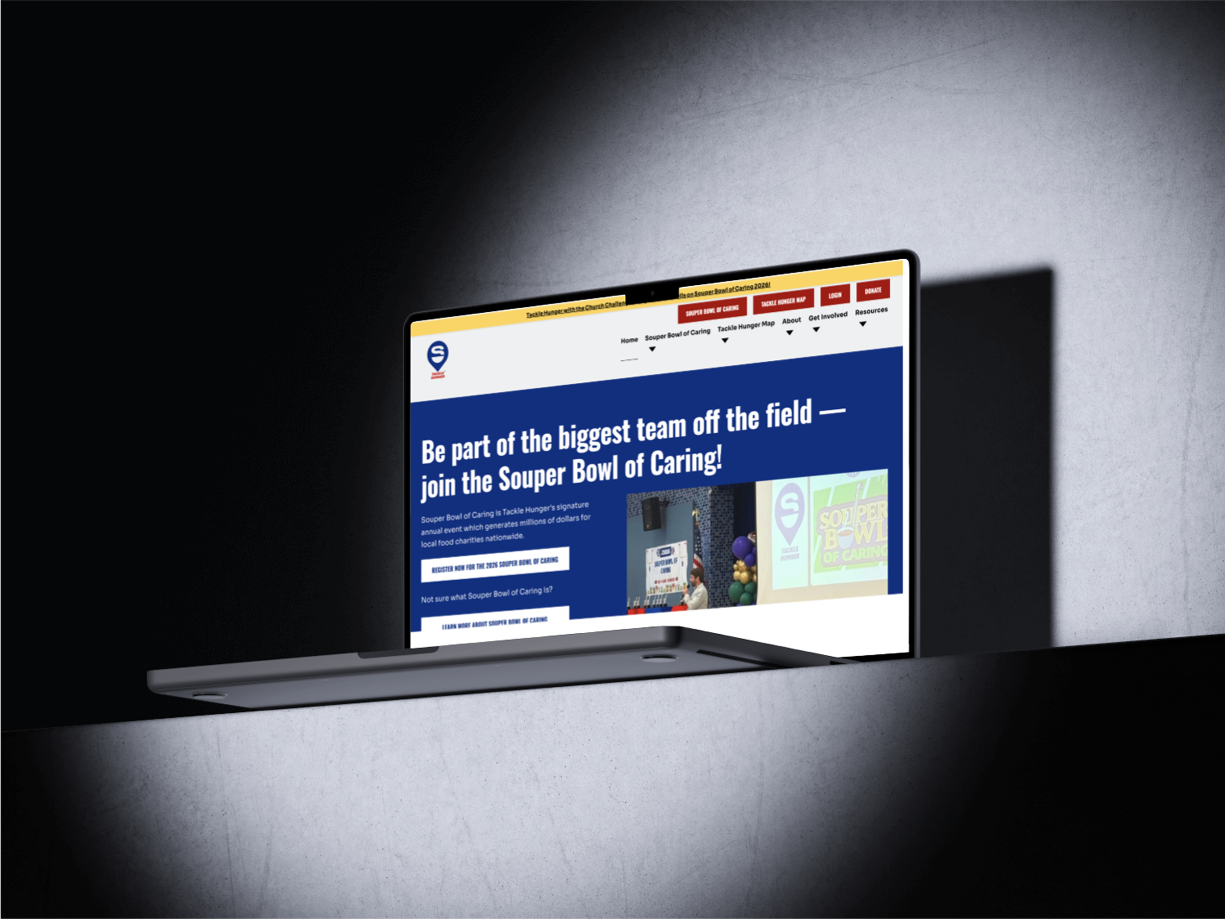
Check out the Re-designed Tackle Hunger Website


Tackle Hunger Home Page Before I joined
Goal
To redesign the website into a clear, action-focused platform that:
Menu Bar
Redesigned into a clean, organized navigation that clearly directs users to key areas.
Prioritizes top actions like Donate, Start an Event, and Find Food.
Resources
Introduced a well-structured Resources tab with clearly labeled categories.
Enables users to quickly find guides, toolkits.
Calls to Action (CTAs)
Designed clear, action-focused CTAs throughout the site that guide visitors to take immediate steps — whether donating, starting an event, or joining a campaign..
Get Involved
Added easy, engaging options for individuals, schools, and community partners to participate.

Research
User Research
Methods:
15 Interviews with core users (SBoC Organizers, Student Volunteers, and Partners)
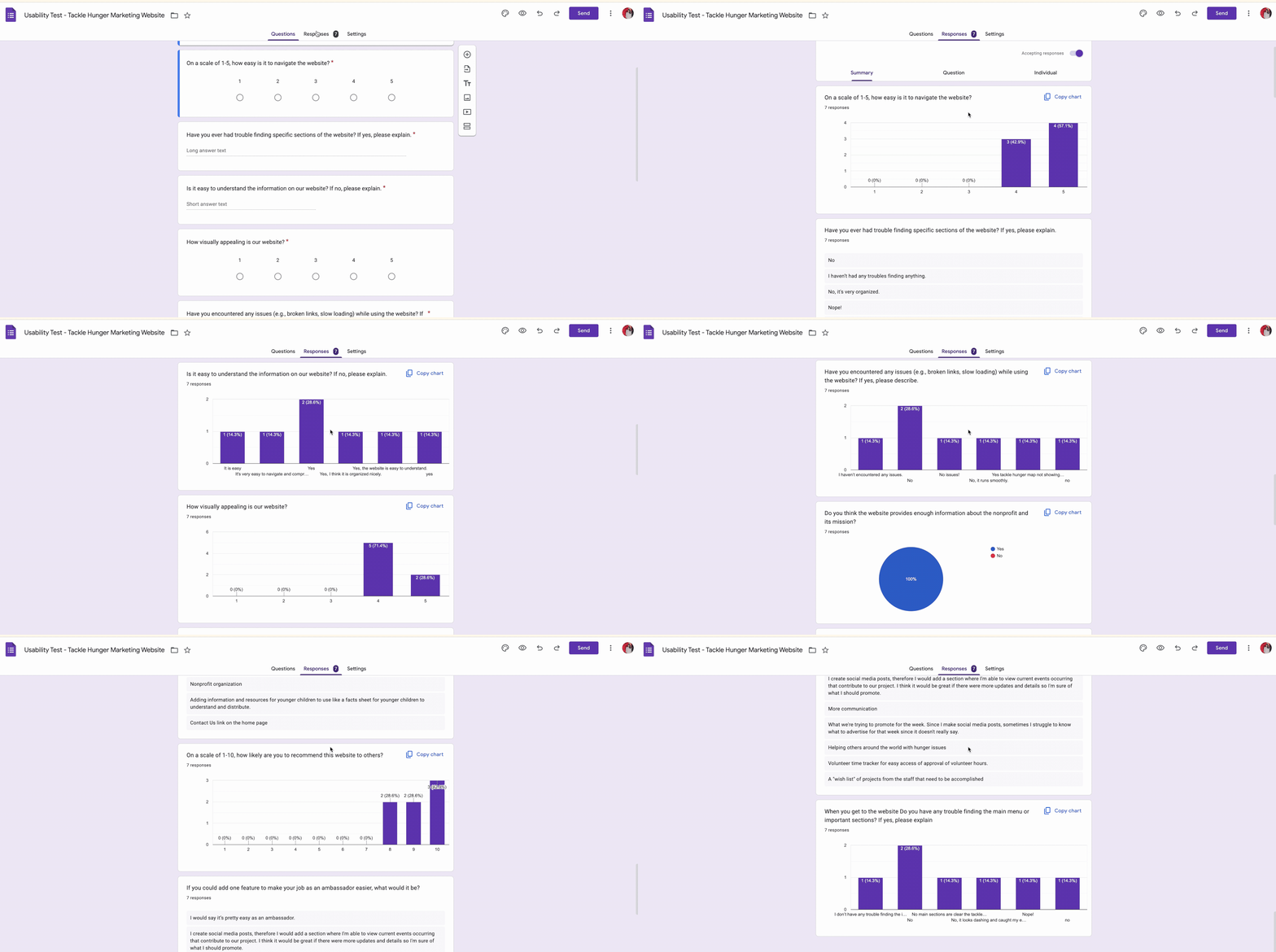
Surveys to measure clarity and satisfaction before the redesign
Competitive Analysis of leading nonprofit websites.
Usability Testing on the Sanity site.

FindingsSome pain points identified are:
Users came to the site with a specific goal (donate, start an event, find help) but struggled to locate the right path quickly.
Student ambassadors using mobile found the site slow and hard to navigate.
Deep menus and hidden resources made it difficult for users to find what they needed.
Event sign-up and resource materials were buried or unclear.